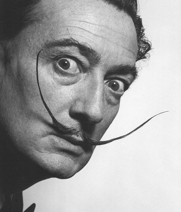
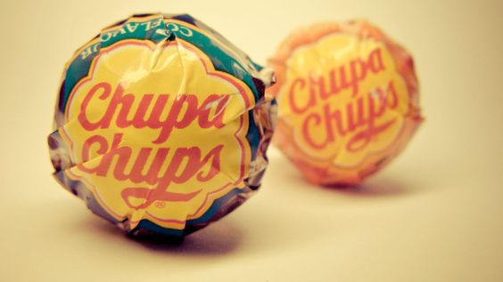
Salvador Dalí, the wacky surrealist known for his signature pointy mustache and painting melting clocks, was also graphic designer behind the classic Chupa Chups–an enduringly sweet, bright rendition of a daisy.
The Catalan lollipop made its first appearance in 1958, when the company founder Enric Bernat hatched the idea of placing a bonbon on a stick. He called the product “GOL,” imagining the candy as a soccer ball and the open mouth a net. It didn’t go over well. So Bernat hired an ad agency that renamed his product “Chupa Chups” (from the Spanish chupar, meaning “to suck”). All that was left was the branding. In 1969, Bernat complained about what he had while having coffee with his artist friend–none other than Salvador Dalí.

According to lore, the painter went to work immediately, doodling for an hour on newspapers that were laying around. Dalí’s version masterfully integrated the wordmark into the daisy design, and has hardly changed since. And Phaidon points us to one subtle, extremely smart feature of the design:
Acutely aware of presentation, Dalí insisted that his design be placed on top of the lolly, rather than the side, so that it could always be viewed intact. It’s proved to be one of the most enduring pieces of branding ever and one that’s still used today, four billion sales later.
What would induce the famous artist to take on such a project? Dinero. The guy rarely turned it down, causing surrealist poet André Breton to nickname him “Avida Dollars”–an anagram of Dalí’s name that roughly translates to “eager for cash.”
By Belinda Lanks
Click to browse orginal text.


